
Color & Contrast: Making Content Visually Pop & Good for Accessibility
Color That Pops and Works for Everyone: A Practical Guide to Accessible Contrast
Color is one of the fastest ways to give a website personality. The right palette makes a brand memorable, guides visitors to the next step, and makes content feel polished. But color that looks striking on a designer's monitor can turn into a wall of unreadable text for someone with low vision, color blindness, an aging screen, or a phone in bright sunlight.
The good news: accessible color and eye-catching design are not at odds. With a few rules and a couple of free tools, your content can pop and work for everyone.
Why Contrast Matters
Contrast is the difference in brightness between text (or other important visual elements) and the background behind it. When contrast is too low, words blur into their surroundings and buttons disappear.
That affects more people than many site owners expect:
People with low vision depend on strong contrast to read at all.
People with color vision deficiencies, roughly 1 in 12 men and 1 in 200 women, may not be able to tell certain colors apart, most commonly red and green.
Older adults often experience reduced contrast sensitivity as part of normal aging.
Everyone else benefits too: mobile users outdoors, people with dimmed screens, and anyone reading on a low-quality display.
Low contrast is also one of the most common issues found in automated accessibility scans, which makes it an easy area to reduce your risk and exposure while improving the experience for every visitor.
The Numbers to Know (WCAG 2.1 AA)
The Web Content Accessibility Guidelines (WCAG) 2.1 Level AA, the standard referenced in the Department of Justice's Title II rule and in many ADA settlements, measures contrast as a ratio from 1:1 (no contrast, like white on white) to 21:1 (black on white). Here are the targets:
Normal text: at least 4.5:1 (Success Criterion 1.4.3)
Large text: at least 3:1. "Large" means at least 18 point (about 24px) regular, or 14 point (about 18.7px) bold.
User interface components and meaningful graphics: at least 3:1 (Success Criterion 1.4.11). This covers button borders, form field outlines, focus indicators, icons, and the parts of charts needed to understand them.
Want to go further? Level AAA calls for 7:1 for normal text and 4.5:1 for large text. It isn't required for AA conformance, but it's a great goal for long-form reading content.
A few things are exempt from the contrast requirements: logos and brand wordmarks, purely decorative elements, and disabled controls.
Small Differences, Big Results
Contrast failures often come down to a single shade. These real examples show how close the line can be:
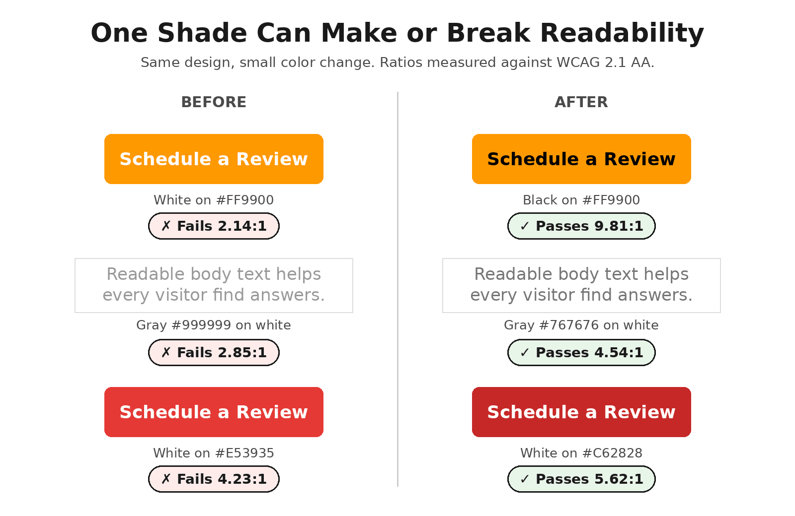
A single shade separates a failing design from a passing one. Each pair keeps the same look while clearing WCAG 2.1 AA.
Notice the orange example. A bright orange button with white text is a popular look, and it fails badly. Switch the text to black (or darken the orange) and the same button becomes easy to read without losing its energy.
Don't Rely on Color Alone
WCAG also requires that color is never the only way information is communicated (Success Criterion 1.4.1). Check out our article on Common Gotchas: Relying on Color Alone for more.
Common trouble spots include:
- Links that are only distinguished from surrounding text by color. Add an underline, or make sure the link color has at least 3:1 contrast with the body text and gains a non-color cue on hover and focus.
- Form errors shown only with a red border. Add an error icon and a clear text message, such as "Enter a valid email address."
- Charts and graphs that use color-coded lines or slices. Add direct labels, patterns, or different line styles.
- Required fields marked only in red. Include the word "required" or an asterisk with an explanation.
- Status indicators like green/red dots. Pair them with text labels such as "Open" and "Closed."
- Watch Out for Text on Images Hero banners with text layered over photos are a frequent source of contrast problems, because a photo has many colors and the ratio changes across the image.
How to Make Color Pop, Accessibly
Accessible design doesn't mean a gray, lifeless site. Try these approaches:
- Build your palette with contrast in mind. For each brand color, create a few darker and lighter shades so you always have a passing option for text, backgrounds, and buttons.
- Use bright colors as accents, not text. Vivid yellows, oranges, and light greens shine as backgrounds, borders, and illustrations paired with dark text.
- Lean on dark backgrounds. Light text on a deep navy, charcoal, or brown can feel bold and modern while easily clearing 4.5:1.
- Create hierarchy with more than color. Size, weight, spacing, and placement help important content stand out for everyone.
- Design visible focus states. A thick, high-contrast outline around the focused link or button helps keyboard users and can be styled to match your brand.
- Check hover and active states too. A button that passes at rest can fail when its color shifts on hover.
Need help? Contact us!